As our multimedia design final project, Sarah Hiscox and I created a lesson on the topic of “Fractions with Food”! Follow this embedded link to learn about how the study of mathematics can be applied to our everyday lives.

As our multimedia design final project, Sarah Hiscox and I created a lesson on the topic of “Fractions with Food”! Follow this embedded link to learn about how the study of mathematics can be applied to our everyday lives.
This week we learned the difference between passive and active learning. Upon reflecting on my own learning experiences in this class and other classes I have taken I would say that the experiences definitely differ in terms of their passivity. I have a background in biology and psychology and have found that many classes I have taken in the past rely heavily on a lecture based design and follow the “information-in, information-out” model that Jennifer refers to in her blog. This may be because she is referring to a K-12 classroom where as I am reflecting on my experience in a university classroom, however, actively engaging with information is important no matter what age the learner is or what learning level they are at.
In this class I feel that we have been provided with lots of “hands on” learning opportunities to be able to demonstrate the concepts we have learned. Other university classes I have taken consist of only lecture material and exams to test retention of the presented material. This design is heavily based in passive learning leaving any active engagement with the material to be the responsibility of the learner which can be difficult when dealing with complex novel concepts. Some classes will have a laboratory component designed to demonstrate course concepts, however, it is not enough to cover the full scope of information being presented in class. It is interesting to consider how more university level classes could incorporate active components and how this would have an affect on the learner.
It is very fascinating to see all the opportunities for creating learning content that H5P provides. I enjoyed using it and appreciate how it can make relatively passive learning material more engaging and active. I am excited to continue to explore the features of H5P.
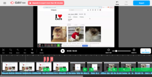
I also wanted to further explore H5P and created a mix and match game from the presented Youtube video on the frog life cycle, please try it out and test your learning! Drag and drop each image of a developmental stage of the frog and match it to the correct title. Use the Youtube video as a resource.
Reference: Images are screenshots taken from https://www.youtube.com/watch?v=etGmCvIL014&t=25s

I chose to update a multimedia project that I created in a previous blog post. After evaluating my project, I realized that there were a few aspects I could improve upon using the skills I have learned in order to enhance the effectiveness of the learning material. The goal of this multimedia learning material is to teach the learner how to complete the task of posting a picture on the social media platform Instagram.
Upon viewing my original project, I noticed that the main downfall is that I did not have any elements to direct the learners attention to the various steps of the process of posting a picture, I only had my computer mouse to highlight features of the instagram page. As well, the browser screen was very busy, this can be distracting and increase extraneous load as it overwhelms the learner with information.
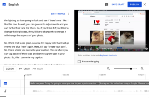
Alt Text: My multimedia project displayed in Screencastify’s editing software
To correct this, I edited my video in Screencastify’s video editing software. I utilized the “zoom” feature in order to manage intrinsic load and utilize the Signalling Principle from Mayers Theory of Multimedia Learning. By “zooming” into the elements of the process while I narrate them, I was able to highlight to the learner what is important and limit the view of what isn’t. From the same theory, I also utilize the the Contiguity Principle by using labels to highlight the “display picture”, the “username handle” and the “photo feed” and keeping these labels close in proximity to the features they are associated with. The Redundancy Principle states that on screen text can be unnecessary when visuals and narration are used due to the Dual Coding Theory’s explanation of audio and visual information processing. However, in this case, the text is used strictly to label features of Instagram’s platform and the Modality Principle related to managing intrinsic load suggests that text can be beneficial if the words are unfamiliar to your learners. I kept this in mind and considered the intrinsic load of my intended audience, as intrinsic load can vary depending on the audience. I decided to use these labels because a learner who is unfamiliar with the Instagram’s platform and is learning to post a picture may be unfamiliar with the names of the various features such as “display picture”, “username handle”, and “photo feed”. In this case, labels would help manage intrinsic load rather than adding to extraneous load.
Alt Text: My multimedia project displayed in the Youtube subtitle editor
When I posted my original project to Youtube, my video had the auto generated closed captioning but I did not edit or inspect them. The auto captioning is often incorrect and does not include proper punctuation, when I inspected them for my upgraded project, I found this to be the case. In Svetlana Kouznetsova’s TEDtalk, she describes how to edit the closed captions and recommends having a transcript in addition to captions. I followed her instructions and made both of these changes to my updated project and found editing the captions to be a simple task that makes a substantial difference in the quality of the captions. These changes make my project more accessible as the correct and legible captions are available to those who can benefit from them, which is not only limited to those who are hearing impaired, as the University of Washington suggests. All learners can benefit and the absorption of the content is enhanced when proper captioning is available.

In Rich McCue’s example of storytelling, what senses does he appeal to in his story? Which of the guidelines does he follow? Are there any that he doesn’t follow?
In Rich McCue’s story telling with video example, he evokes emotion in order to get the point across about backing up digital files. He does this by using various story telling techniques. He immerses the listener in the story by using strategically chosen images that relate to the part of the story he is telling and by painting a detailed picture of the scenario using descriptive words and explaining feelings. The story he tells is also a personal one, adding to the captivating nature of the story. He builds suspense by telling the story in chronological order, leading up to the tragedy that destroyed his students laptop. He does this by explaining how a brand new laptop looks and feels and by providing details of his conversation with his student, rather than revealing the tragedy right away. He uses dialogue in his story which allows the listeners to have a clear picture in their head of the scene, in doing this he employs the “show, don’t tell” technique. In this specific story I think it would be difficult for him to use the technique of “bringing the characters to life” as it is a personal story involving only him and his student. As well it does not appear that he uses the “S.T.A.R moment” technique but this could be due to the short nature of the story. He does end with a positive takeaway by explaining what you can do to protect yourself against losing your data and lets the audience know that his student follows these back up suggestions and now has peace of mind.
Rich also reduces cognitive load in his video by ensuring that the video is short and to the point (segmenting), he provides narration with complimentary pictures (matching modality), and he does not have any distracting music or extra animations (weeding).
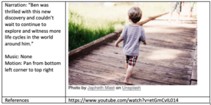
At first, I found creating a story board difficult as I had trouble determining what it was that I wanted to teach through a story. I decided to create my storyboard this week in the same theme of my lesson plan and create a story involving life cycles. However, I made the learning outcome for this story simpler in order to fit into a short story context and I wanted my story to have a children’s book feel to it. If this storyboard were to be used for learning material, it would likely be a different age/learning ability than my lesson plan was created for in my last blog.
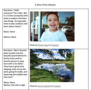
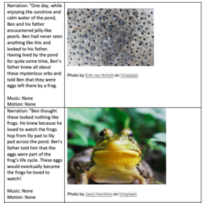
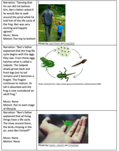

This week I created a lesson plan teaching the lifecycle of a frog. I created this lesson based on backwards design and started with the goal of learning the life cycle of a frog, I then began to work backwards by creating an associated learning assessment and creating learning outcomes and evidences of learning to meet that goal and prepare learners for the learning assessment.
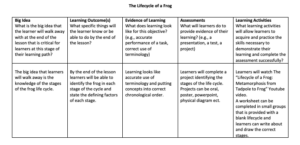
When creating this lesson, I consulted Merrill’s First Principles of Instruction. There are five principles that Merrill deems essential for effective learning. The five principles are as follows:
The concept of the frog life cycle is valuable to understanding the concept of metamorphosis in other species and lays the foundation for future biological study regarding growth and reproduction. Science helps to understand real-world phenomenons. Progression of complexity can also be applied here by first introducing the stages of the life cycle and then breaking it down into the defining characteristics.
This principle refers to activating prior knowledge or providing foundational experience. If learners had experience with the general concept of a biological life cycle (ie cyclical stages that form a repeating cycle) then this could be prior knowledge that could be activated.
Demonstrating what is to be learned can be done in the way of the media video narrating the life cycle of a frog and showing relevant video demonstrating what is being narrated. This provides audio and visual demonstration of what is being learned. The chosen video will need to demonstrate all concepts required in the learning assessment.
Applying the new learning is done in the way of completing worksheets in small groups. This way, learners can practice organizing the life cycle in chronological order and practice discussing the concepts with peers, solidifying the learning that has occurred. The worksheet can also include a drawing section allowing learners to demonstrate the concepts with visuals that are meaningful to them.
This principle refers to demonstrating, integrating, and creating using the newly learned information. This principle can be incorporated by having the learning assessment be in the form of a project. The learner can choose the medium for the project, giving them control over their learning and allowing them to demonstrate what they have learned while assisting learning at the same time by getting the learner engaged with the material.
After designing the lesson plan, I looked for media that would clearly demonstrate all the concepts necessary to achieve the learning goals and assist learners in completing the learning assessments and activities. This video provides audio and visual information about the stages of the frogs life cycle and the associated physical changes. I could take this further by creating my own media perhaps in the form of an infographic to show these concepts and reinforce the learning outcomes.
In one of my previous blog posts “Enhancing Accessibility“, the WAVE accessibility software found that the teal hyperlink text colour had too low of contrast, however, I could not determine how to change it and believed it to be embedded in the template. This week, I have figure out how to change it! I ran this post through the WAVE software and did not get a low contrast notice for the green colour I have chosen for the hyperlinks.
This week I choose to create an infographic using the design platform Canva. I decided to create an infographic on the 4 principles to reduce extraneous cognitive load mainly to use as a reference for myself while working through the rest of the course.
Alt Text: An infographic displaying the 4 principles used to reduce extraneous cognitive load: The redundancy principle, the coherence principle, the signaling principle, and the contiguity principle.
Creating My Infographic
I made sure to incorporate a few key design principles when creating my infographic:
Hierarchy: I made the title of the infographic the largest text font and put it at the top. This helps direct the readers attention to the top of the infographic and signals that the information begins there and continues down the page.
Contrast: I utilized contrast by the text and the pictures having their own designated sections on the infographic, as well the pictures are in a colour that “pops” from the rest of the infographic to help facilitate the association between the information and the pictures.
Colour: I used saturated but complimentary colours to create my infographic, however, I made sure to stick to a small colour palette to maintain cohesiveness and so as not to overwhelm the reader.
Proximity: I ensured that text was beside the associated picture so the reader does not have to guess which picture goes with which description and to give a natural flow to the infographic.
Negative Space: I left lots of negative space in my infographic to allow the reader a break between information and to enhance cohesiveness as explained in the youtube video “White Space in Infographic Designs: Why It Matters“. I made sure not to include too many details and just included the relevant definitions of the principles as introduces by the topic of the infographic.
Design Principles and Mayer’s Principle of Multimedia Learning
It is interesting how many of the key design principles align with the principles for reducing extraneous cognitive load in Mayer’s Principle of Multimedia Learning. The proximity design principle is very similar to the contiguity principle and the hierarchy principle is similar to the signaling principle. Clearly these principles are analogous for a reason and reinforces the concepts and ideas of how we process and learn information.
Final Thoughts About Canva
This was my first time using a design software such as Canva and I thoroughly enjoyed it and found it very fun to create! I found the software to be easy to use and I enjoyed how it constantly suggests creative design choices. I will definitely continue to use Canva in the future in my professional and personal life.

Photo by Daniel Ali on Unsplash
ALT text: a metal sign secured to a brick wall stating “Accessible Entry”
Making Online Spaces More Accessible
I really enjoyed learning about enhancing accessibility and inclusion in multimedia design and learning. Having accessible media online that assists those with disabilities intake the information presented is important to ensure no one is excluded from online media and can also have positive effects for all users and learners. It was great to see how many tools there are available to enhance accessibility and to learn how to implement these changes. This week, I will use two of these tools, the WAVE accessibility checker and the Speechify text reader to assess my previous blog post for adequate accessibility.
Analyzing My Previous Blog with WAVE
After running the WAVE software on my previous blog post, “Exploring Sketchnoting“, I saw that there was numerous aspects of the post that did not meet the accessibility evaluation standards. First of all, I did not include ALT text information for my embedded picture. This is especially important as the blog mainly discusses the process of a drawn picture I had attached. As well, the WAVE software indicated that there was low contrast between the light teal colour of my hyperlinks and the background. I attempted to correct this but it appears that this is a feature of the template I have chosen and hyperlink colour can no be changed. This is something I will try to rectify and something I will keep in mind when creating media in the future. The WAVE software also alerted me that synchronized captioning should be available for a Youtube video I had hyperlinked and that auto captioning provided on most Youtube videos may not be sufficient. I watched this Youtube video with autocaptions on and found that this is absolutely correct. Within the first 30 seconds of the video, I spotted errors that made the captions difficult to understand. Synchronized captions or a transcript should have been provided for this. I also had a second video embedded portraying a TED talk. When watching this video with captions on, I noticed that the captioning was much more accurate than the Youtube video, however, if they were not, synchronized captions or a transcript should have been provided for this as well.
Analyzing My Previous Blog Post with Speechify
I used the text reader Speechify to analyze my previous blog post. I found that I was able to mostly understand the blog post using the text to speech tool, however, it would have been easier to understand if the image of my sketchnote had alternative text describing it. A header underneath the TEDtalk video that I wrote my sketchnote from would have been useful as well. I also noticed that Speechify does not indicate punctuation such as quotations nor does it indicate when hyperlinks are used. I assume that this is because Speechify is mainly used to listen to speech in conjunction with reading the text or to read large blocks of text only.
The Takeaway
I found the experience of analyzing my previous post very eye opening. My previous blog post was not as accessible as it should be and requires the changes detailed above in order to be more inclusive. Moving forward from this assignment and associated readings I will be much more mindful when creating media online and I am eager to learn more about the ways to make online spaces and creations more accessible.
Alt Text: Photograph of a completed “sketchnote” created from a TEDtalk on effective communication
Reflecting on the Experience
This week, I attempted Sketchnoting while listening to a TEDtalk by Julian Treasure on the topic of effective communication. Although this is a video, I listened to the audio only to focus on my sketchnoting and creating my own visual experience. This was my first experience taking notes from learning material in this way and at first it did not feel natural to me. While listening to the talk, I found that I was worried about not transcribing all the information presented and missing important points. However, when I was finished I found that I could follow my sketchnote and remember the lecture. After completing this activity, I do see value in combining images with notes to aid in retention of material as discussed by Rachel Smith. I am curious to see if this absorption of the material is held over time and will come back to my sketch note at a later date to test this.
Creating the Sketchnote
Prior to listening to the TEDtalk and producing my sketchnote. I viewed the instructional video by Doug Neil on sketchnoting. Personally, I am not experienced in drawing so Doug’s video aimed at sketchnoting “without drawing” was very helpful for me. I utilized his techniques of conveying importance through text size and style and using containers and arrows to connect and segment ideas.
What Principles are at work?
When viewing my sketchnote as something that myself as a learner will use to recall information later there are a few principles from Mayer’s theory of multimedia learning that I believe are at work here. The first if the Coherence Principle. When creating my sketchnote, I was mindful to only include and emphasize information that would be helpful to my learning and retention. I avoided “decorating” the sketchnote and drew only visuals that related to the ideas presented. The Signalling Principle can also be applied. I used headers when possible and went into further detail underneath them to allow for a sense of organization and to direct my attention to important information and main points.
My Learning Material
Below is the TEDtalk video I created my sketchnote from. It is a great talk that anyone can related to as it can be applied when having conversations with others in daily life as well as in important and professional situations. It also relates to the concept of teaching when using your voice as narration is utilized.
Navigating Instagram
Screencastify is an example of a tool that can be used for online multimedia learning. This week, I used Screencastify to create a screencast showing how to post a picture to the popular social media platform, Instagram. Instagram can be used for personal use to share pictures and videos with family and friends. It can also be used as a powerful marketing tool for businesses, providing a direct way to engage with customers and clients.
Providing Effective Instruction
When creating my screencast, I had to make choices about how to lead this instructional video in a way that enhances the learning of the viewer. I consulted Mayer’s Theory of Multimedia Learning, which assumes that learners take in information through two separate channels, the first being a visual channel and the second being an auditory channel. This assumption means that Screencastify is an effective teaching tool that utilizes both visual and auditory presentation. It is also important to consult Cognitive Load Theory, which focuses on minimizing effort wasted on distractions (extraneous load), managing working memory capacity (intrinsic load), and optimizing what the learner understands (germane load).
In order to minimize extraneous load, I had to be cognizant of how I was presenting the material. I considered the Coherence Principle from Multimedia Learning Theory and did not include any unnecessary information or details and abstained from including any background music. I also considered the Redundancy Principle and focused the presentation on visuals and spoken narration and minimizing text on screen (Davis & Norman, 2016).
References
Davis, G., & Norman, M. (2016). Principles of Multimedia Learning. Wiley University Services. https://ctl.wiley.com/principles-of-multimedia-learning/

I am taking the course EDCI337 to become more experienced in creating and connecting online. I appreciate the value of online learning and the ability to apply these skills in a variety of fields, especially in the current age of technology where online meeting spaces are becoming integrated in many aspects of our lives. Online learning is often discussed in the context of academics and employment, however, I am particularly interested in the field of healthcare and how multimedia platforms can be used to enhance healthcare delivery and patient experience.
As shown in this video, telehealth can be a great tool to provide patients with care, especially during the COVID-19 pandemic. With the increasing popularity of telehealth, it is interesting to consider if this type of digital engagement could be utilized in other medical settings as well, such as rehabilitative medicine or mental health. While not all aspects of care can be delivered online and many in-person aspects cannot be replaced, it may reduce barriers and provide care to a wider reach in our communities. Through this course, I hope to learn more about how people connect and interact digitally and how to enhance one’s experience online.
© 2026 Darby's Blog
Theme by Anders Noren — Up ↑

Recent Comments