This week I choose to create an infographic using the design platform Canva. I decided to create an infographic on the 4 principles to reduce extraneous cognitive load mainly to use as a reference for myself while working through the rest of the course.
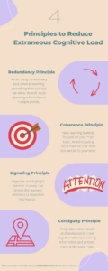
Alt Text: An infographic displaying the 4 principles used to reduce extraneous cognitive load: The redundancy principle, the coherence principle, the signaling principle, and the contiguity principle.
Creating My Infographic
I made sure to incorporate a few key design principles when creating my infographic:
Hierarchy: I made the title of the infographic the largest text font and put it at the top. This helps direct the readers attention to the top of the infographic and signals that the information begins there and continues down the page.
Contrast: I utilized contrast by the text and the pictures having their own designated sections on the infographic, as well the pictures are in a colour that “pops” from the rest of the infographic to help facilitate the association between the information and the pictures.
Colour: I used saturated but complimentary colours to create my infographic, however, I made sure to stick to a small colour palette to maintain cohesiveness and so as not to overwhelm the reader.
Proximity: I ensured that text was beside the associated picture so the reader does not have to guess which picture goes with which description and to give a natural flow to the infographic.
Negative Space: I left lots of negative space in my infographic to allow the reader a break between information and to enhance cohesiveness as explained in the youtube video “White Space in Infographic Designs: Why It Matters“. I made sure not to include too many details and just included the relevant definitions of the principles as introduces by the topic of the infographic.
Design Principles and Mayer’s Principle of Multimedia Learning
It is interesting how many of the key design principles align with the principles for reducing extraneous cognitive load in Mayer’s Principle of Multimedia Learning. The proximity design principle is very similar to the contiguity principle and the hierarchy principle is similar to the signaling principle. Clearly these principles are analogous for a reason and reinforces the concepts and ideas of how we process and learn information.
Final Thoughts About Canva
This was my first time using a design software such as Canva and I thoroughly enjoyed it and found it very fun to create! I found the software to be easy to use and I enjoyed how it constantly suggests creative design choices. I will definitely continue to use Canva in the future in my professional and personal life.
Leave a Reply